(Editor’s Note: This post is brought to you by Kronos, the global leader in delivering workforce management solutions in the cloud. Ventana Research just named Kronos the top “Hot” vendor in workforce management and ranked the latest version of Kronos Workforce Central as the top product. Congrats – a very well deserved honor. Enjoy the post!)
My new fascination is mobile photography. I believe having good cameras on our phone (or phones on our cameras) has turned digital photography on its head. When 41% of people share 1-2 photos a day on Facebook, Instagram and Twitter, it really makes you think about how images are changing social media and the way we do business.
Today’s Time Well Spent cartoon from our friends at Kronos captures the importance of a good visual. Just like the right photo tells a story, data presented the right way can paint a picture for us. I believe it’s one of the reasons infographics remain popular. Data and statistics presented in an eye-catching way can speak volumes.
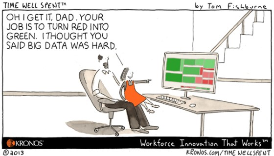
Compiling relevant data is important. Ensuring data is accurate is critical. Presenting data in a way that makes it easy to read, digest, and get acted upon is essential.
0


Terry Portillo says
I wish the first speaker at the symposium I attended today (on Woman and Global Poverty) would follow this advice. She gave an hour and a half PowerPoint presentation she must have spent weeks preparing – easily one hundred slides – most difficult to understand – then graced us with handouts: a microscopic printout of all of her slides. It’s very tricky to act on data that can neither be read nor digested. The symposium’s final speaker (on empowering Pakistani women by setting them up as honey bee cultivators) had only a few slides – priceless pictures she had personally taken on her trips to Pakistan and a few key points in large font on other slides and her presentation was absolutely captivating. When it comes to PowerPoint less is definitely more!
Sharlyn Lauby says
Thanks Terry! Years ago, I wrote a post about good PowerPoint tips I learned at an ASTD event: http://smartblogs.com/leadership/2011/06/21/astd2011-7-tips-to-enhance-your-next-presentation/ Comes in handy every time I need to prepare a presentation.
TC says
Excellent point that keeps coming back to me. We need to make things interesting on our presentations, websites and blogs. So many people from so varied backgrounds come to see the data we put out. The easier you make it to be understood the better.
There are people who are excellent brains and academics but fail to put their ideas forward in a way that is understood by most people. And there are those people who could teach anything to even a five year old. People have a very short attention span especially online and you need to grab it as fast as you can. I agree here with you 100%. Lovely blog by the way.
Sharlyn Lauby says
Thanks. Your comment reminds me of the Einstein quote, “If you can’t explain it to a six year old, you don’t understand it yourself.”