Make Your Data Easy to Consume – Friday Distraction
Years ago, I worked for a company that decided HR was going to produce a “metrics scorecard” each month. Three full pages of data about HR activities. Everything from cost per hire and time to fill to grievance trends and training effectiveness. I’ve always joked that HR closed the month similar to the accounting department. It took us days to prepare every report and distribute it.
But make no mistake. It was a great report about what was happening. And it had a lot of valuable information. But I would go into meetings where my colleagues were talking about issues and I knew there was valuable information on the report I had just sent them. But they weren’t reading it. Not because they didn’t know how, but because it wasn’t easy to consume.
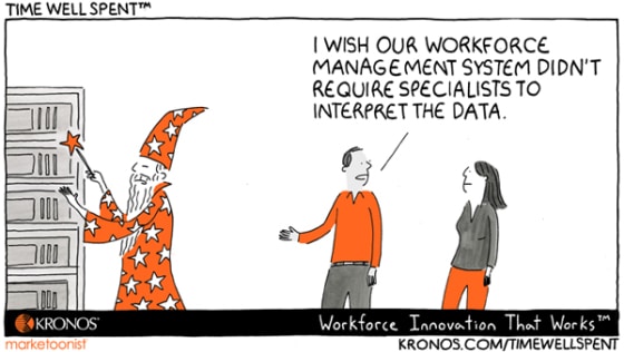
I was reminded of that story when I saw this Time Well Spentcartoon from our friends at Kronos. Whenever we’re responsible for reporting data to the organization, it needs to be in a format that’s easy for them to digest.
Ask stakeholders what information matters to them. If people aren’t paying attention to your data, find out why. Is it because there’s too much? It’s too complex? It’s not the data they want to see?
Develop a data dictionary. Have a document that explains how every data point is calculated. You don’t have to show everyone, but it will help maintain consistency. At least until you build an audience for your data. No one asks the finance department how they calculated EBITDA.
Find out how they want to see the data. You know your company culture. Are they the spreadsheet type? Histograms? Pie charts? Maybe they want colors or smiley faces? (Don’t laugh. Smiley faces can be a very effective way to get someone’s attention.)
Be ready to supply more information upon request. Once you start distributing the data that managers want to see, in the format they want to see it in…watch out, because they will want more. Trust me. And that’s a good thing!
How did my story end? Well, we asked senior management what metrics they wanted to see and took the 3-page document down to one sheet with a dozen numbers. (We still produced the full report for our corporate offices.) They read it. And guess what? They liked what they saw and even asked for more.
Most organizations make decisions based on data and numbers. However, organizations do not all gather the same data, present it the same way, or evaluate it using the same criteria. So before sharing the numbers, make sure the audience can easily consume them.
15