The Golden Rule of Giving a Great Presentation
For many of us when we’re asked to do a presentation, we have to wear three hats:
- Developer – We have to put together the outline, references, resources, etc. We’re the developer of content. The good news is we’re also the subject matter expert. We know our stuff. So this step is about curating the right information.
- Designer – This one is a bit tougher. Often when we tell people to draw or be creative, the first response is “I’m not an artist!” But when developing a presentation, it’s part of our job to incorporate visuals into the content that will help us tell an engaging story.
- Deliverer – Lastly, we’re responsible for communicating the content. Whether it’s on a webinar or a conference stage, we have to bring the content to life. We need to practice our platform skills and come prepared to share the content we’ve created.
Even the best developers, designers and deliverers need help telling their story. It’s hard to wear all three hats successfully. Sometimes we get two of them perfect, and the third one…well, not so much. I know for me, my love of minimalist design can have an impact on the way my presentations are received. (Translation: maybe I need to put more images in my presentations.) The question is “How do I make that happen?!”
That’s why I was very excited to be invited to the Association for Talent Development’s (ATD) Visual Storytelling Certificate Program. The program was delivered in partnership with Duarte Inc. They were the firm responsible for creating the graphics for Al Gore’s keynote that formed the basis for his Academy-Award winning film, “An Inconvenient Truth.” I figured if Al Gore needs help with his PowerPoint, then I shouldn’t be afraid to spice up my presentations. Our facilitator, Michael Duarte, said during the session, “Take a risk and lose a fear.”
What I learned was amazing. If we want to tell a good visual story, we have to start with good content. I wish you could see the StoryMap template they gave us. It provides a clear, logical way to organize content. More importantly, it gives us the shape (or flow) for a great presentation. I learned that every great presentation has a formula. The logical part of me loved this. From Martin Luther King Jr.’s “I have a Dream” speech, to Steve Jobs’ iPhone launch keynote and even the Gettysburg Address – they all follow a formula.
Nancy Duarte explains the formula in her TED talk on “The Secret Structure of Great Talks”
https://youtu.be/UfQF3DXG-S4
After learning the structure of a great presentation, we focused on creating visuals to support the story. I will share with you one very cool activity we did called “wordmapping.” I’ve mentioned before that visuals are a very important part of learning. But practically speaking, with all the copyright laws out there, it can be a challenge to find images that can really support our content.
Wordmapping is similar to mind mapping but with images. With wordmapping, you can visualize concepts in a new way. For example, let’s say you’re planning a presentation on workplace security. What’s the first image that pops into mind? Some people might say a padlock.
But instead of using the image of a padlock, do this instead:
What does a padlock make you think of? (1)____________________
What does (1)___________ make you think of? (2)______________
What does (2)___________ make you think of? (3)______________
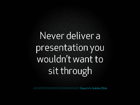
Now you have 4 image options: a padlock – if you must, plus (1), (2), and (3). From a design perspective, we get to be more creative. We have more flexibility. And we allow our audience to use their creativity as well. That’s why the golden rule to presentations is this:
“Never give a presentation you wouldn’t want to sit through.”
That was the big takeaway for me. I want to sit through presentations that makes me think. I like facilitators who don’t spoon feed me information. A simple activity like wordmapping made me realize that I don’t have to sacrifice images to give my audience their space to think. I don’t have to use literal images to tell a story.
![]()

If you’re like me and you’re looking to step up your game when it comes to designing great presentations, check out Duarte’s Visual Storytelling program being offered by ATD. They provide tons of resources that you will immediately use back in the office.
Lots of people say it’s time to kill PowerPoint (or Prezi or Keynote, whichever one you use). I say it’s time to use it more effectively. Visual learners like it. And if we’re supposed to be learner centric, then it makes good business sense to deliver what our audience wants.
Image courtesy of Sharlyn Lauby
0